Designing for everything through iteration.
competitive analyses, moderating usability testing, wireframes, hi fidelity design, partner agency collaboration
In 2018, Meijer launched an effort to move digital experiences to Adobe Experience Manager (AEM) to better serve evolving technology and business needs. At the same time, an effort to establish design standards and a digital design system for a more consistent Meijer digital experience was kicked off with the help of accelerator agencies. A major part of this was redesigning the Meijer.com header with accessibility, performance, and brand standards in mind while creating a masthead that was flexible across Meijer’s numerous web properties and microsites.
design system creation, user flows, competitive analysis
Challenge: Bring together thinking to align a roadmap for Meijer and accelerator agencies to replatform Meijer’s web presences while also creating consistent visuals and interactions.
With a nebulous ask and quick deadline, I worked to quickly pull together key needs for development to begin. This included an interim style guide for developers to leverage until a more robust design system could be delivered, sitemaps and user flows to identify key content types and needs, analyses of competitor headers and navigation, and various informational architecture considerations to streamline links and help identify their hierarchy in our users’ mental models. All decisions were backed by real-time analytics, industry case studies, and live, in-person usability testing sessions.
Work cross-referenced various internal style guides, communications, and business needs all while was focusing on mitigating user barriers to digital experiences by emphasizing accessibility and inclusive design to provide a concise starting point for development to begin.
user flows, wireframes, testing, prototypes, interaction design, user interface design
Worked to evaluate existing features to identify most relevant info in the context of the app home screen, define card structures to convey existing features and content, propose card structures and behaviors for new “recommended” features to drive personalization inn the app experience.
- identified additional improvements outside of business needs to improve user experience such as the mPerks ID barcode, related coupons in suggested items
Publication + Packaging Design
I was fortunate to work with the amazing Nucraft team, led by Jesi Hook, to design physical collateral for the 2015 NeoCon events. As the Junior Graphic designer, I worked with existing brand standards to create the 2015 Training Manual and packaging for a physical Media Kit to be given to representatives at the event.
UX Design + Typography
The graphic design program at Kendall College of Art and Design always has custom branding for the entire senior show. I was extremely excited to work with my amazingly talented colleagues to define and produce the 2015 senior show theme, branding, and wayfinding. Together we created a cohesive yet playful brand, labeling physical rooms as "brain spaces" we occupy during the creative and professional process.
Branding + UI + UX + Advertising
Open provides tools to manage invisible disabilities (such as anxiety and depression), promote awareness to reduce stigmas and break barriers, and encourage dialogue with professionals and support systems through a portable ecosystem of tools headlined by the website and app. No matter where you are, what you are doing, and who you are with: you’ll have the tools you need to manage, cope, and communicate.
Publication + UX + Social Design
The exhibition functions as a demonstration of limited perspectives and the subjectivity of reality in relation to internalized discrimination. Utilizing RGB lights and corresponding ink colors, certain messages (i.e. those written by other markers) become invisible, showing only limited points of view. Taking place in a hole in the wall in a hole in the wall, all printed material evokes a sense of neglect contrasting with the bright, vivid colors.
Wordpress + Development + UX
With an emphasis on design innovation and sustainable practices, the Louis Kazan collection is one of the most luxurious brands in contemporary furniture. I was fortunate enough to work closely with Jesi Hook, the lead designer on this project, to bring her vision to life with a custom WordPress build and custom transitions to showcase the refined, minimal nature of the brand.
Brand Refresh + Advertising Campaign + UI + UX
The brand makeover supports the regional bank’s recent growth as they offer new locations and services. With a goal to appear more friendly and highlight community involvement, the new mark has updated colors and a more organic form. The brand campaign unfolds as print ads describing the chemical makeup of money set against priceless moments. The tagline: It’s your money. It’s what you make it.
UX + Integrated Campaign
The Red Cross Blooms campaign illustrates the impact of the individual and kicks off with a magazine ad and a biodegradable paper insert embedded with flower seeds. Organic typography and bright crimsons are used to add interest and elevate the design to feel greater in scale. The website documents the response and allows digital story submission and “bloom paper” purchase options. For every story gathered, the Red Cross plants a red tulip in a field. Time-lapse documentation shows the flowers initially spell out “Teach Your Children,” with contributions forming the Red Cross logomark.
Publication Design + Copywriting
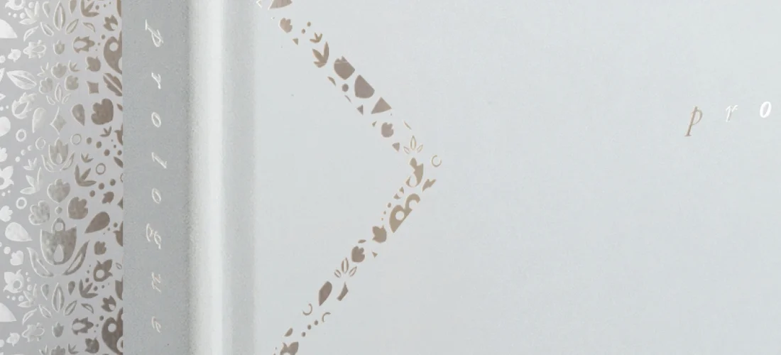
This book is a personal exploration of endings as a concept and a device through the format of fairytales. Fairytale “happily ever afters” sounds strangely final, as though the “ever after” portion had neverreally happened, and time froze these characters. There was an echo and holloweness once the story had ended that I sought to remove. Taking the very last sentence of the original story, I made something new. These stories interact with the open layout while typographical and illustrative elements add a classical twist, mirroring the classic stories being taken and molded anew.